Back

2022

Recruitment

Web app

Workshub: Redesign of the tech Job Board

Context

WorksHub is a tech hiring platform aiming to connect developers with growing businesses. There are two core groups of people who use the product: job seekers and hiring company managers. Today I'll tell how we approached improving the experience of job seekers.

Why we needed a redesign

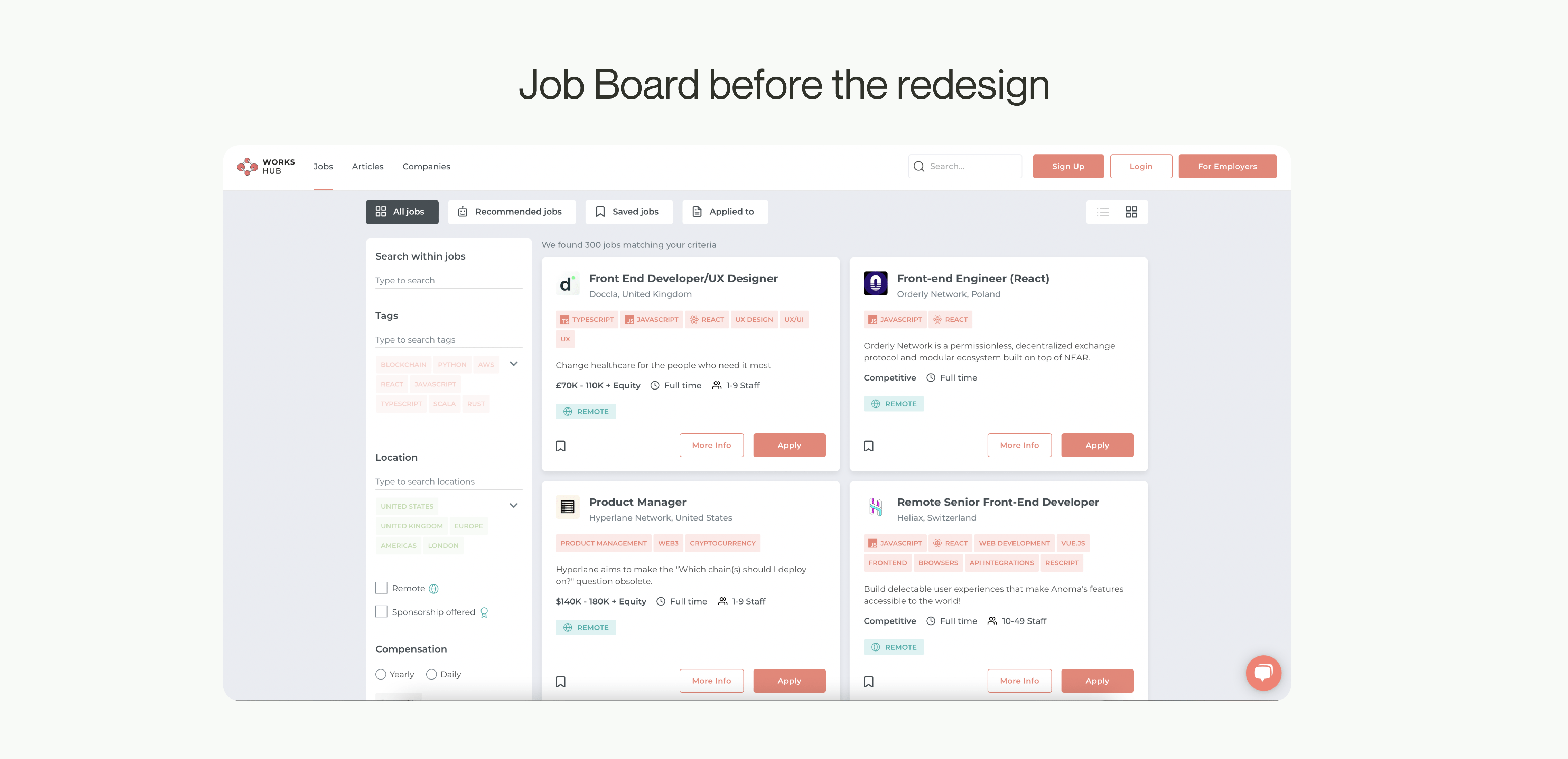
Based on user feedback and usability audit, we saw a number of UX issues with the job search process: the behaviour of filters was sometimes unpredictable and imprecise, there were a lot of UX flaws and a lot of unnecessary cognitive load for users during the process.

Process

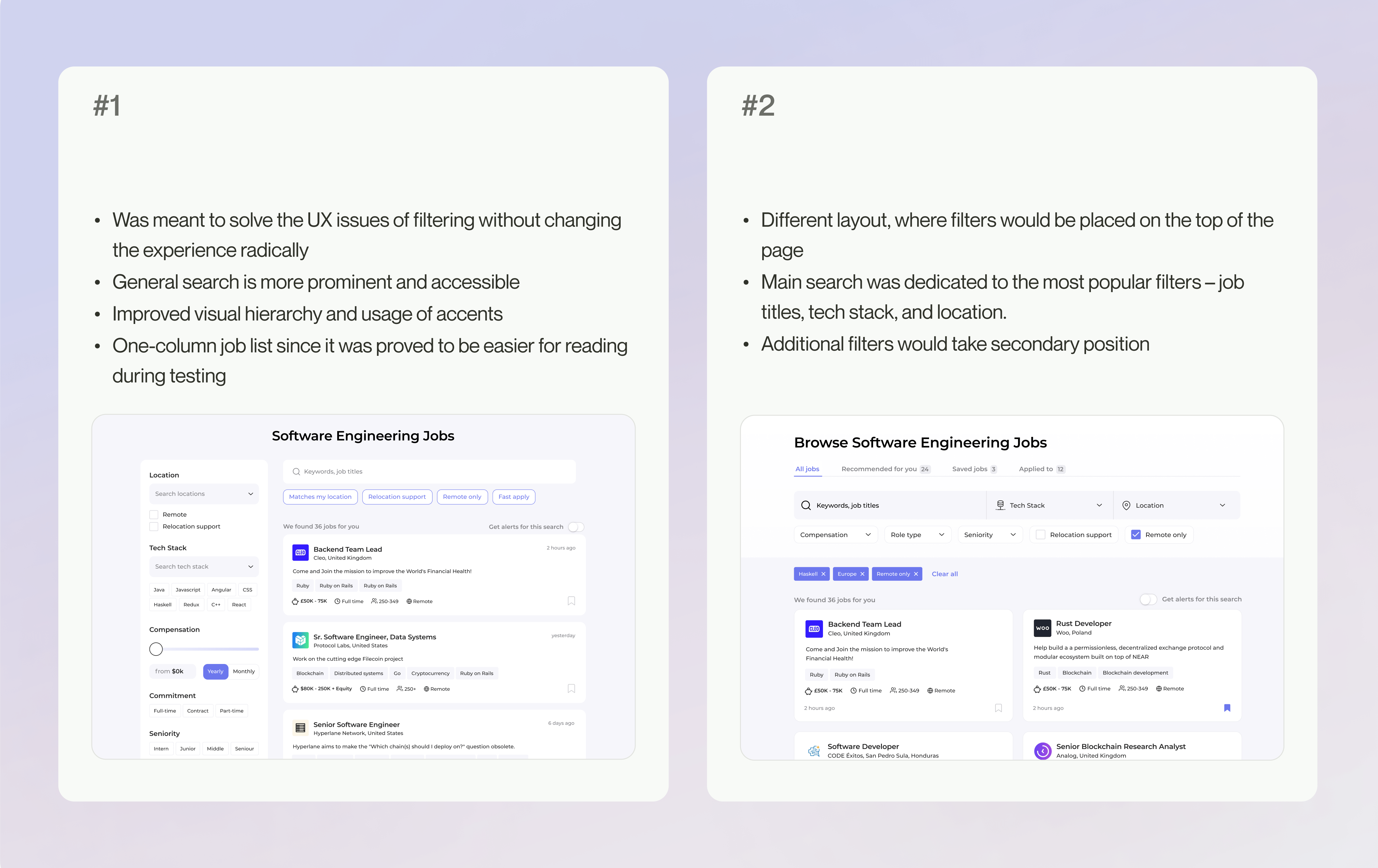
Together with the Product Manager we spent some time trying to understand how users search for jobs on our website. There’re multiple ways to do that. We looked in the analytics and visualised user flows “as is” and “to be”. The last one was later updated multiple times

At the same time, we also conducted usability testing of the old page. It revealed multiple problems with filtering and showed that the overall layout with left-sided filters didn’t serve the usability. With the left-side filters, it required more time for users to understand what was going on, compared to Jobboards, where space on the top of the page was dedicated to filters. With such filters, they got the idea of the page straight away.

What we did next is we composed a list of all problems we found during the audit and distributed ideas into Must have, Should have, and Could have depending on our priorities and technical limitations

We did an analysis of competitor Jobs Boards and filtering flows. I also looked into filtering practices that are used in e-commerce platforms to collect broader design references.

Research takeaways

  • Almost each filter on our Job Board was either inconvenient to use or behaved unexpected
  • The most popular filter people used were: ‘remote jobs’, ‘location’ ‘tech stack’
  • During the user interviews we also found out that for many users it’s important to select specialisation like frontend, full-stack, etc. Our website didn’t provide this opportunity as the there was a belief that our target audience relies strongly on tech stack selection only
  • Each job card had an “Apply” button, which allowed people to apply to jobs randomly, without even reading the full description. The result is lots of irrelevant candidates.
  • Search bar wasn’t visible enough because users attention was drawn by tech stack tags
  • Too many accents and visual noise, Job cards are excessively detailed.

First iteration: choosing direction

I had two concepts in mind:

We discussed these early designs with the team.

The feedback was quite controversial, it still wasn’t evident which direction is the optimal one, so I decided to go forward with both and see how real users would interact with them.

Usability testing

The main thing that I wanted to observe how the motivation and requirements to the new job of each respondent would be reflected in the job search.

We interviewed respondents about their personal criteria for the job search and then asked them to show how they usually look for jobs on their favourite websites. Then I could compare it with how they were doing the same job on my prototypes.

Final design

Finally, we had a small round of usability testing and met with the development team for the tech evaluation. As a result, we have the following design:

  • Category selection and tech stack got combined in a large search input
  • Added fast-access tech tags
  • Improved secondary filters
  • We now display applied filters right in the search input

Application via chat bot

Workshub has an unсonventional application form – through the chat bot. As part of the job search/application flow I also worked on redesigning the bot.

  • Some people struggled to understand that the window they see is an application form because of the unfamiliar format. They would write to support asking how the can apply. I made a small change and added a small caption “Application assistant” to reassure people that they are in the right place
  • We wanted to make the login more straightforward by adding functionality for login with social media
  • The moment where a lot of users dropped-off was the the step where we asked to upload a CV. Apparently, not all people have their resumes always prepared, so we also added possibility to attach a link to LinkedIn or personal website.
  • We are expanding the range of questions that companies might require from candidates, e.g. information about the formal education or languages proficiency. So my goal was also to integrate new questions to the existing flow

Feedback

The feedback form was extremely helpful in identifying issues that real users are experiencing. The responses gave us lots of ideas for the next design iterations.